
Communal Dashboard
22 August 2012

With the growing interest in data analytics and visualizations, we're seeing more effort put into interesting visualizations that allow people to draw insight from data floating around in an organization. Most of these dashboards are aimed at individual usage, but there is a growing tendency to use them for a more communal purpose.
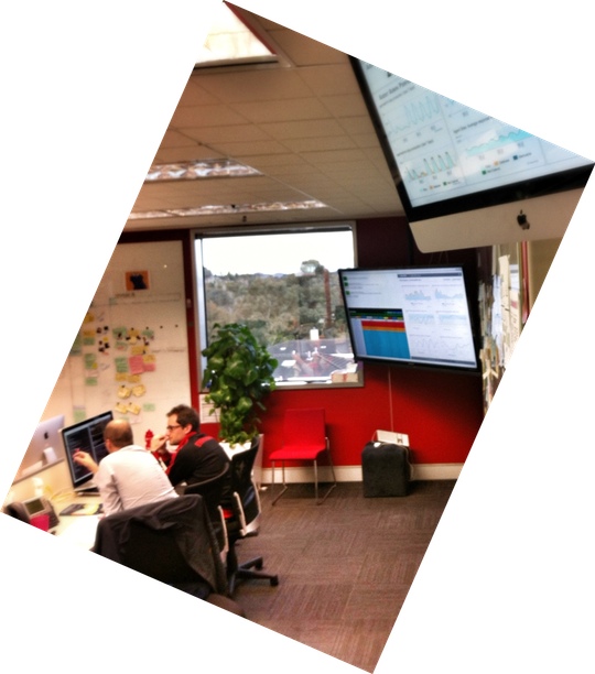
photo: Nigel Dalton
REA-Group in Australia are extensive users of communal dashboards within their development team areas
The idea is to have display monitors in semi-public places within an organization. This allows many people to see the information in the communal dashboard. This is less about helping people make decisions, more about educating people about what's happening, providing background information and context for their regular work. One person put it as creating an emotional engagement with how the business is running. People in the agile software community will naturally see these as a form of information radiator[1].
An example of this comes from Redbox, a company that operates vending machines of DVD rentals in North America. Their dashboards display data that includes a running count of the total number of rentals ever made, a table showing the top movies rented recently, and a speedometer showing rentals per second. The information is shown on various displays around the office - the rise of cheap flat-screen monitors has made this a much less costly exercise than it used to be.
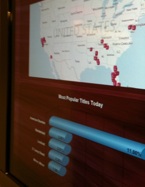
photo: Chris Kapcar
Part of Redbox's communal dashboard
Imaginative presentations help to grab attention. One of Redbox's displays was pushpins on maps indicating the locations where new Redbox machines were opened in the past 7 days. As the day and week drew on you could see where new Redbox machines were sprouting up.
Another company sells visually unique products (similar to houses or cars). It used a tetris like falling icon display with a photo of the product when it was sold, inspired by Apple's app wall.
Web browsers, in a full-screen mode, are usually a good choice for this. Increasingly libraries are available that allow dynamic visualizations to be generated in javascript and HTML 5.
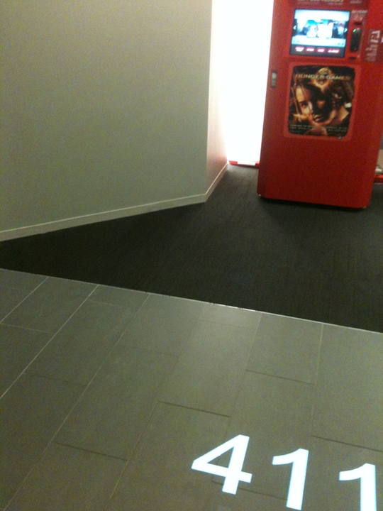
photo: Chris Kapcar
The display medium can also be more imaginative. Redbox projects a running counter of the day's rentals onto the floor outside their main lobby.
These are crude visualizations, they can't show much detail, nor can they be interactive. However they can generate an awareness of what's happening, creating a connection between office staff and a otherwise distant day-to-day activity. Visiting business partners are other target viewers. The display of information on a screen like this makes a natural entry point for a conversation that can help oil some deal-making.
It may not be clear how much influence these dashboards produce. One heavy user of these commented that they didn't seem to engage people, they weren't triggering new conversations over coffee. He counsels that to get people to engage with this information you often need a human touch, such as a leader asking questions based on what's being displayed.
Acknowledgements
Bill Caputo and Chris Kapcar were very helpful with giving me information about the experiences at Redbox. Nigel Dalton and my colleagues John Johnston, Tyler Mercier, and S.M. Sohan provided useful project information.Notes
1: I see communal dashboards as a subtype of information radiator, one that's connected to a live feed of data, and thus dynamic. Static paper posters are an example of an information radiator that isn't a communal dashboard - but are often very effective.